 By:SOCIALisBETTERNo, I’m just kidding. Please don’t fire your book designer (if you have one). They are amazing people who know exactly what to do to make your book belong on the shelves at Barnes and Noble. Surprisingly enough, however, they charge for this service. The audacity! [AN: That’s sarcasm, dear readers] As such, we understand it’s not feasible for every author to hire a pro. It’s okay!
While it would take a year of blog posts to discuss every habit of highly effective book designers, the good news is that there are a few simple rules to keep in mind that will make a world of difference in how your book is perceived. This go-around, we’re focusing on body copy or interior layout design. That is, the “meat-and-potatoes” text in your book, where all the magic happens. Since this is where your readers are going to spend the vast majority of their time with your book, let’s be sure they’re not cursing the gods of printing when they do so.
7 Steps to More Professional Book Design
- Have the right tools. If you’re planning on self-publishing more than a couple of books, seriously, save yourself a ton of time and effort and purchase Adobe InDesign, the industry’s standard for layout design. It’s pricey, but with experience and/or training, this is the best way to get professional results.
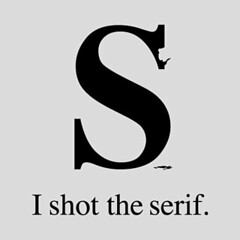
- Know your font types. A serif font (like Times New Roman, not Arial) is commonly used for the body text of lengthy works, such as a novel, and for good reason: most type designers feel that serif fonts are more easily readable than their sans-serif counterparts, as the flourishes help guide the eye from one character to the next.
- Choose your font wisely. Choosing Times New Roman as the font for your body copy will identify you as an amateur almost immediately. Minion is the most popular choice, but at $275+ for a complete set, it may not be appropriate for all authors. A close second, ITC Baskersville is more affordable ($99 for the complete set), and still a very nice choice. If you’re looking for something more along the lines of, say, free, you probably already have some fonts living happily on your computer you can use. Check out Palatino, Bodoni, Garamond or Book Antiqua.
- Watch your leading. Nothing hampers readability like every line being squished up against the previous one. To prevent this, increase your paragraph leading (space between lines) to be 2-4 points larger than your type size. In Microsoft Word, for example, you can select your text, and right-click Paragraph to change ‘Line Spacing’ (what leading is called in Word).
- Not too big, not too small. As the book length is of utmost importance when you’re self-publishing (as many printers charge by the number of pages), your first instinct is to go with as small a font size as possible to decrease the number of pages and increase your profit. Not so fast! Grandma Emma isn’t going to pay for a book she needs a magnifying glass to read. To keep things readable, choose a font size between 10-11 points, depending on your font. Premium fonts, like Minion, will often take up less space than the ones pre-installed on your system, as they were designed specifically for printing.
- Where am I? Don’t forget page numbers and chapter titles. These provide visual breaks for your readers and give them a quick reference point at a glance.
- Don’t forget the details.
- Use page breaks wisely. The last thing you want is a blank page right in the middle of your book.
- Use Paragraph rules rather than pressing the ‘Tab’ button to indent. Trust me, you’ll save yourself a lot of time and headache if you ever need to copy and paste your work into another form. When using Paragraph styling in Word, be sure to change the default of a .5″ indent – a good rule of thumb is to make your indent size at least as wide as your font size, but less than your leading (or line spacing).
- Watch for orphans (the first line of a paragraph ending a page) and widows (less than ten words ending a paragraph at the top of the page). Don’t worry about these as you’re writing, but when you make your final pass-through (starting from the beginning of the book), take care of them if they are particularly bothersome.
- Don’t put a blank line in between paragraphs. For two reasons: 1) ease of copy-and-paste, as mentioned previously; and 2) it screams amateur. If you’d like some additional spacing in-between paragraphs, use Paragraph styling.
- Use only one space in-between sentences. The two-space rule is very 90’s (think New Kids on the Block) and no longer applicable.
- Use ‘Justified’ text-alignment. It’s what most readers are used to seeing and will immediately lend your book more credibility.
For more on book design, check out the amazing Book Designer for more helpful hints and tips, the Basic Book Design Wikibook for answers to your broad questions, and Faceout for beautiful book design inspiration. As always, if you have any questions, don’t hesitate to leave a comment or ask @duolit.
 We're
We're