You need a compelling book cover design.
*collective groan*
I know, I hear you guys out there. You’ve gotten the message from design advocates all over the web. Most prospective indie authors understand that they should create an effective, awesome book cover, but think that it’s too much work for too little reward.
Maybe you’re one of those authors. Have you convinced yourself that you like your default Createspace cover? That it gets the job done? After all, the content is the most important part of your book…right?
I hate to break it to you (please don’t shoot the messenger), but that default cover doesn’t get the job done and, while quality content is very important, no one will have the opportunity to read it if they’re not compelled enough by your cover design to learn more. You need a book cover that inspires action. Not convinced yet? Stick with me!
3 Reasons Why You Need A Compelling Book Cover
1. You are not a special snowflake.
 A coworker recently told me a story of working at a music store in the early 90’s. On Super Bowl Sunday, Whitney Houston belted out her amazing rendition of the Star-Spangled Banner. On Monday, customers were lining up to purchase it.
Her record company was so taken aback by the demand that they had little time to produce the single itself, let alone fancy artwork for it. The tape had a plain white cover with the title and artist printed in a default typeface — the end. The result? It sold like gangbusters anyway because no one gave a hoot what the tape looked like — the song was that good.
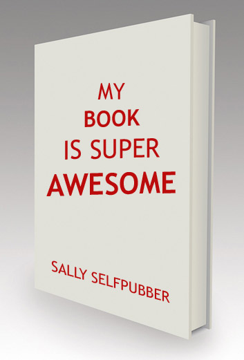
Taking the theme to books, you’ll frequently see covers for classics that look like this. You know — Tolstoy, Austen, etc. Their books don’t have to look amazing because people are going to purposely seek them out and buy them anyway.
Sadly, you’re not Tolstoy. And that’s okay! I know I’m sure as heck not Austen. But recognizing this allows us to pair our books with effective cover design that speaks to our book browsers, converting them into readers.
After all, would you pick up that book by Sally Selfpubber? I wouldn’t. Judging by that cover, she thinks she’s a mack daddy like Tolstoy who’s totally above compelling design. She’s not, and her sales will suffer for it.
2. Your competition has compelling cover design.
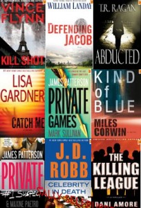
 Go to Amazon and check out other books in your genre. Just the top 10 or so. Seriously, go ahead — I’m not going anywhere.
What do you see? Are there common elements among the designs? Look at the colors, the typefaces, the imagery and the general look and feel of the covers. The designers that worked on these books didn’t have a Spock-ish mind meld, causing them to choose similar design elements — they did what you just did. They checked out what works (hey, if a book is in the top 10 on Amazon, the author is doing pretty well) and emulated elements of it; improving where possible.
Do you want to be stuck with a stock Createspace book cover showcasing rainbows and kittens while everyone else’s covers portray grisly crime scenes and moody skylines? Heck no! Your book deserves more!
3. Marketing results depend on effective book cover design.
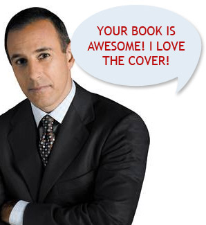
 When you have a compelling book cover, it markets itself. Picture this: you’re sitting on the Today Show promoting your latest book (it could totally happen). In most cases, the book itself is somewhere close by. You’re either holding it, they show it while you’re talking or (if you’re really lucky), Matt is waving it around like it’s the greatest thing ever.
Picture the cover of that book. I’m not going to pretend to know what it looks like, because it’s your book, but I’m going to guess it looks pretty awesome. I bet you’re darn proud of it. And, you know what? If you think it’s awesome, odds are your readers will too. They’ll want to learn more.
Your book cover will be seen everywhere you go — in both online and offline marketing. It’ll haunt you at every book signing, interview stop, blog tour locale and bookstore for the entire life cycle of your book. This is why it’s so important to get it right!
2 Ways To Get Compelling Book Design
Are you begging me to pretty please stop with the reasons why you need an effective, amazing, compelling book cover? Indie authors are smart cookies, you totally get it. If you’re like many self-pubbers, however, you’re going to have one of two complaints:
- I don’t have any time. I have 5 kids and work 85 hours a week and my cat needs adrenaline injections 12 times a day and I have to go buy milk and the closest store is 100 miles away.
- I don’t have any money. Seriously, I ordered pizza last night and had to scrounge together change from couch cushions to pay the delivery guy. He totally judged me. And he drove a Pinto.
Excuses be gone! There is a solution for both of the above situations. The downside? They each require a serious investment. Compelling design doesn’t come cheap, and that good ol’ principle of economics holds true: no matter the decision, there’s always a cost involved. Whether that cost is monetary or not depends on which route you choose:
- DIY. There’s no sugar-coating it: DIY design, especially for authors without any design background, is seriously hard work that you have to do right. I know this sounds super cliche, but you only get one chance to make a first impression.If you’re going to go this route, my #1 piece of advice is this: take your time. Study other books in your genre, design in general, get feedback from readers as you go and drop your ego at the door. Not sure if you’re headed in the right direction? Drop us or the amazing Christine (one of our Indie Ninjas) a line. We’re willing to check out your cover and give you some tips.
- Go pro. Find a designer who fits your personality, timeline, aesthetic and budget. All that time you had to put in to go DIY (at the expense of your cat’s health)? Now you can use it to focus on everything else (editing, proofreading, marketing, watching TV, etc.).The downside? It takes cold hard moolah, baby. Luckily for indie authors, there’s a whole industry popping up of design pros who are willing to do some pretty amazing work for a totally affordable price. Ahem…did I mention I’m one of those pros?
No matter which route you choose to end up with that compelling book cover, just do it. Your book sales and marketing effort will thank you (your competition, however, will not).
What do you think?
Do you have any questions about compelling design — how to achieve it, which route is best for you, how I know you’re not really Tolstoy? Drop me a line or ask away in the comments!
 We're
We're 


