Hi there! Duolit is on hiatus, but please feel free to explore our extensive archive of posts and our free Weekend Book Marketing Makeover. Thanks for visiting!

Why Book Covers Scream (or, How Cover Design Affects Feelings)

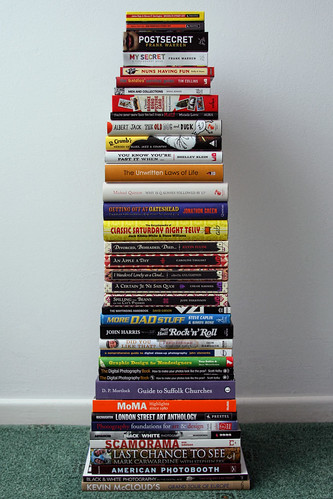
Photo: db*Photography | Flickr

I’m sick of thrillers screaming at me.

As I walk through the Mystery/Thriller section of a bookstore, I feel my chest tighten with anxiety. My eyes are assailed by the PERMA!CAPSLOCK, high-contrast colors and striking imagery that adorns each cover.

But, perhaps that’s the point.

Mystery/Thriller authors WANT you to feel anxiety, tension — perhaps even fear. And that’s before you read even one word.

How would this change for a romance novel?

What about a memoir?

How about YOUR book?

As far as readers are concerned, their first exposure to your book’s message is through its (hopefully) appropriate and effective cover.Continue Reading

Choosing the Best Book Cover Designer for Your Book

AN: Below is an excerpt and a link to a guest post I wrote for The Creative Penn. It was originally published on June 17, 2010.

I’ll never forget my first book cover design presentation. It was for a church directory and, man, I was on my game.

My passionate, detailed explanation of the design decisions made, coupled with reasons for their effectiveness – sprinkled with just the right amount of humor — was persuasive and professional. To this day, I still haven’t topped it.

I finished my presentation, ready to be bathed in the warm glow of “Wow! What incredible work!” and “Amazing! We’re so glad we hired you.”

What I received instead was Myrna and her 11 friends in the design committee staring back at me with varying looks of displeasure and confusion. Gulp.

Cricket. Cricket.

They totally didn’t get it and, therefore, hated it. Total book cover design fail.

I’ve never been so crushed. But, this led me to an important realization:

You’ll work better with some book cover designers than others.

[continue reading ‘Choosing the Best Book Cover Designer for Your Book‘ at The Creative Penn]

Design: 7 Things To Know About Book Design [Self-Publishing Basics]

Note: For an updated version of the information below, download Self-Publishing Basic Training for FREE (you’ll also get some nifty extras)!

Photo: iboy_daniel | Flickr

Well recruits, our series on Self-Publishing Basics is beginning to wrap up! We hope you all have gotten as much out of reading it as we have writing it — it has been a wonderful way to organize what can be a jumbled, confusing process. For a recap, check out the previous posts on Pre-Planning, Writing, Editing, Reasons & Tips and Details.

Riddle time! What’s the first thing readers will (or won’t, if it’s done correctly) notice about your book? Hint: it’s also the first way it will be “tested” for self-publishing stigma.

The answer is design. Kinda obvious since it’s the title of the post, huh?

As seemingly everything involved in self-publishing, design can be complicated. Some authors spend too much time here, while others don’t spend enough — the ideal is that perfect middle ground of a great-looking book that doesn’t cost you a fortune or take months to complete. To that end, we now present our list of things you should know about book design:Continue Reading

Book Cover FAIL: Forgetting Your Target Market

This is a post in our ongoing Book Cover FAIL series and part of this week’s focus on target markets.

Half of all Americans start each day with a bowl of cereal.

Which is your favorite? Personally, I love Frosted Flakes. I started eating them way back in elementary school. Tony the Tiger would appear on my TV in between episodes of Muppet Babies and I was hooked. Heck, we even shared a name!

Why did I want to hang with Tony? I was smack dab in the middle of their target market (apparently, elementary school kids watching Muppet Babies). The bright box colors, flashy commercial, cool mascot — I was hooked. And that box design, man. What kid could resist that box? I mean, it says THEY’RE GRRREAT!

Looking back at it now, I kind of hate the box design. The red against the blue gives me a headache. Tony looks creepy. The milk looks fake. The font used for ‘Frosted Flakes’ is obnoxious. But you know what?

It doesn’t matter what I think.

Frosted Flakes doesn’t care what I think. Seriously. I’m not in their target market, so I’m not SUPPOSED to like their box.

What about your book? Do you keep your target market solely in mind when designing your cover? If not, you may be committing Book Cover FAIL No. 4: Forgetting Your Target Market.Continue Reading

Book Cover FAIL: Lack of Research and/or Focus

This is the second post in the Book Cover FAIL series, focusing on the common causes of cover design mistakes by self-publishing authors and offering solutions to avoid them.

In the do-it-(all)-yourself world of self-publishing, the  total responsibility for all aspects of your book’s production falls squarely on your shoulders as the author. Creating the cover is no exception. While many POD printers offer step-by-step “cover designers,” they offer little in the way of design advice or direction.

Putting the best face on your book doesn’t have to be stressful! Here’s two more common ways to commit book cover failure and how you can avoid falling into their trap!Continue Reading