Hi there! Duolit is on hiatus, but please feel free to explore our extensive archive of posts and our free Weekend Book Marketing Makeover. Thanks for visiting!

7 Lessons to Improve Your Author Website (or, Learn from My FAIL!)

Not sure how to set up your website? Check out Have a Beautiful Author Website for Under $20/mo (Even if You’re Not A Geek).
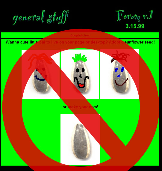
The website I had reviewed — scary, huh?

At the tender age of 14, I submitted my first website for a design review.

My masterpiece came together after only a few days spent tooling around in GeocitiesI thought it was awesome — it featured a sharp black background, electric green content table, rockin’ aLtErNaTe capitalization, and sweet graphics made in Paint Shop Pro. I even had a page where you could adopt a sunflower seed (the terrifying screenshot you see on the right).

The result? A total disaster.

I’ll give the reviewer a bit of credit — she could tell that I was young and doing my best, but that made her review no less scathing!

According to her, my website was cluttered, hard to read and had little to interest any visitor. In fact, she said most would click away with a major headache!

I was crushed.

From that web design kick-in-the-face, however, I learned valuable lessons about what works in web design — lessons that are still true today.

The bottom line: my teen self produced a website that lacked purpose, effective design and relevant content. Visitors ran away screaming.

As a 14-year-old design n00b, fleeing visitors meant nothing but a learning experience. If *your* visitors skedaddle, however, readers and book sales vanish with them. And that? Sucks for both of you.

Don’t blame yourself for your website’s ills! You may not be a web geek, but you can fix each of the problems I’m about to share. Correct them today, and your visitors’ headaches will be a thing of the past!

1. Geocities.com/SouthBeach/Sandbar/3445 is NOT professional.

If you kicked it with me during the Geocities era, the URL above will look familiar. While those long addresses are (thankfully) a thing of the past, even a subdomain (such as yourname.wordpress.com) dings you on the credibility-meter.

The fix is cheap and easy: register yourauthornamehere.com and use it to your advantage!

2. Readers want to know *you* as well as your work.

Luckily, 14-year-old me had the good sense to keep her photo and personal deets off that Geocities site. You, however, don’t have that luxury!

Readers may like your work, but to earn a lifelong fan they must engage with you, care about you, and remember you. Showcase your personality throughout your website content, including an “About” page with some flair.

3. A page about your sunflower seed obsession is not necessary.

I loved sunflower seeds so much (thanks, Agent Mulder), I dedicated a page to them on my website. The reviewer had a field day with that one!

The lesson? You don’t need a separate page for everything under the sun. Overflowing navigation overwhelms and confuses visitors! Consolidate all you can — 5-7 main pages should do the trick.

Try this exercise: write down all the pages you think your website needs. Then, cut out half!

4. Know your audience. Design for them!

Unbeknownst to me, my website’s reviewer was a 30-year-old mom. Being a 14-year old teen, I designed my site for others like me.

Again, this wasn’t a big deal at the time, as my website didn’t need to appeal to moms. Whoever your target market, however, design your website’s content, navigation, color scheme and layout for them. Just because you love gold and LOLcats doesn’t mean they will!

5. Give your website a reason for existing.

To be quite honest, my Geocities site had no real purpose. I wasn’t trying to convince anyone to do anything, I was just showcasing my personality.

Your site, on the other hand, has an extremely important purpose — to turn visitors into readers!

To do this, give each page on your website a job; that is, give your visitors something to do. For example:

  • Home page -> sign up for mailing list
  • About page -> follow me on Facebook and Twitter
  • Books page -> purchase My First Novel
  • Media page -> download media kit
  • Contact page -> fill out contact form

Giving each page a job serves another important purpose: preventing your visitors from running into a “dead end” and abandoning your site!

6. You are not an elusive secret agent.

Back in the day, I loved The X-Files and pretended I worked for the FBI. As such, I believed everyone was out to get me and included no contact info on my website.

Nowadays, visitors find nothing more frustrating than being unable figure out how to contact you.

As an author looking for readers, it’s your job to be accessible! Remember: you want to engage on a personal level with those potential readers, to show them you’re a human being. Make your email address, social media links and contact form prominent and easy to use.

7. No one wants to see content from two years ago.

That first website of mine sat, unchanged, for 2 years after I stopped updating it. *facepalm* It sounds harsh, but having outdated content on your website says to visitors, “I’ve given up on my career and my readers and have potentially fallen off the face of the Earth.” 

This is especially evident on your site’s blog. If your first post is from more than a month ago, you have three options:

  • write new posts (and set a new posting schedule you will stick to)
  • remove the dates (involves editing your website’s template — holler if you need help)
  • remove your blog (may be as simple as editing your menu or involve more template editing)

Outside of your blog, check over your other content once a month to keep it fresh!

More Website Tips and Goodness
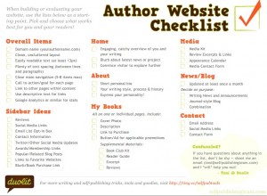
There you have it — the basics I learned from that scathing review of my first website. Could your website use even more love?

If you’re a list-kinda-author (I’m right there with you), download my Author Website Checklist. It’s a sweet PDF that will give you more deets on what this web designer thinks your website should include. Feel free to print it out or share it with your friends!

Website technical junk leave your head spinning? No fear! Just give us a shout and we’ll help you make changes to a current website or create a new one from scratch. And, if you’re an awesome Indie Ninja, you’ll save 33% on those already affordable services!

Talk Back!

I hope that I’ve gotten a little better at this whole website thing in the past 13 years! If you have a spare moment, won’t you boost my ego by leaving a comment? I’d also like to hear what you think about your own website: what do you like about it? Is there anything you’d like to change?

  • I liked this so much I wanted to Tweet it.  I may be visually challenged this morning but I couldnt find the Tweet button…   :)
    Lots of good reminders for a critical review of my own sites though, thanks!

    • Ha! Funny you should mention that, Jemima…I just added a nifty little sharebar :-) Sorry about not having it up sooner and thank you for your kudos!

  • Leslie

    This is so helpful. I know my site needs HELP!, and this is timely. I know color schemes can turn people off but it’s lack of contrast that does me in the fastest. If my eyes get fatigued too quickly, I just stop reading. Those white text on black backgrounds are a killer!

    Thanks! …and I thought the sunflower seeds were nifty cool.

    • You know what else gets me? Small text. Like, sometimes I even feel like the text on our site is tiny and it’s 13px, at its smallest. If I go to a site with anything smaller, I’m all “ack! I can’t read anything!” 

      Readability is *key* — if visitors can’t easily read your stuff, they’ll click away and find another author. 

      Leslie, I’m curious: what, in particular, do you think your site needs help with?

      PS: Thanks for humoring me with the kind words about my sunflower seeds. I wish I could say my drawing skills have improved over the years…

    • Leslie

      I changed the template I use (wordpress) because the one I’d been using didn’t have options. The new one is very bland, which is probably better. I like things to be easily organized and also easy to navigate. I don’t know if I’m there yet, but it’s getting better…

      I know what you mean about small fonts. Most of what I stumble across is fine, but there are days I just can’t manage to squint and sit close/far enough from the screen.

      I never appreciated my youthful eyes enough. lol

  • This is great — and funny (as usual). One thing that helps me is the idea that it ain’t gonna be perfect but we can start a blog and/or website and improve it as we go. I was so focused on all the “don’ts” that it took me a while to get mine started. Thanks for the valuable information!

    • You are exactly right, Diana! We *so* need to write a post about that. That’s the great thing about electronic media in general (whether it’s a website or an ebook) — it *doesn’t* have to be perfect the first time around. It’s way easier to change a website than a print book! 

    • First of all, I just blogged about trying to figure out why I was having such a hard time wanting to do send any time working on my blog/website.  For me, as you mentioned, it was the lack of purpose that you mentioned.  It was killing me and rethinking that purpose based on changes in my career is proving difficult.

      I was glad to see that others have faced these same problems and I really needed the advice you provide.  Also, I needed to hear what Diana wrote as well.  Websites and blogs are works in progress and it’s okay if they don’t come out of the gate absolutely perfect.

    • Exactly, Ray. I always think it’s better to put *something* up and go from there (hence, my horrific first website ;-)) 

      Good luck redefining your site’s purpose — give me a shout if I can help you work through it.

  • Surfynbyrd

    You mentioned mail lists, this is interesting.  I have spent my morning researching this.  I have a wordpress.com account and I have signed up with mailchimp.com to create these lists and campaigns.  But now that I am all ready to go I’m not sure that I can add the mailchimp plugin to my blog.  Any insight?

    • Hi there! Honestly, I’m not entirely familiar with wordpress.com since we have our own installation of WordPress, but even if you can’t install the Mailchimp plugin for WordPress, you should be able to add the code for your mailing list into a Text  widget in the sidebar like so:
      1. Log into MailChimp.
      2. Click Lists.
      3. Click the blue ‘View’ button next to the list you want the form code for.
      4. In the gray navigation bar (above the title for your list), click/hover on For Your Website and then click Subscribe Form Embed Code.
      5. Copy the code given and paste it into a Text widget in WordPress.

      Worst case scenario, you could also grab your Signup Form Link Code and point people to the signup form that way. Hope this helps!

    • Elizabeth

      Hi Toni,

      I have been working with Mailchimp to get this sorted out over the last few days, and I wanted to come back and let you know how it worked out.  The only change from your instructions above is when you click on ‘For Your Website’ you have to click on ‘Signup Form Link Code’ (your second option on the list), not the subscribe form embed code.  Then you’re good to go.

      Thank you for taking the time to walk through this. Hopefully this will help others in the future!

    • Aha! Thanks for coming back and letting me know how it turned out :-)

  • Hey thanks for linking to my About page! So glad you guys approve. :)

    • You’re quite welcome, Belinda — your site is great! 

    • Thank you! It’s taken me about seven years to get there. So I agree with your statement that it takes time and effort to make an effective website!

  • louisaj4

    Thanks for this! I especially appreciate the tips about giving your website a “purpose” — this one I really need to work on. That, and thinking about who my intended audience is. Great post!

    • Thank you, Lousia! Purpose is definitely key. If I answer any questions about your site, in particular, just give a shout to [email protected]!

  • Anon E. Mous

    Nothing wrong with Paint Shop Pro. I make money designing professionally with it. It functions just as well as Photo Shop in its later versions.

    • Absolutely — it helped me learn and practice the basics of digital design. Even though I don’t use it anymore, I remember it fondly. PSP FTW! 

  • Allison Tait

    Great post! Wish I’d found your author website checklist when I was putting my own site together a few months ago (www.allisontait.com). But I have most of what you suggest and am working on the newsletter and a few other bits and pieces. Thanks for the tips!

    • You’re so welcome, Allison! Your site looks great (LOVE the word tree). Good luck finishing it up, and if there’s anything we can do to help, just shout!

  • Thanks for the great tips. I’ve got a lot of spring cleaning to do and may need to call for help before spring is over. You’re an awesome duo!

  • Very convenient! I’m exactly at the point where one gets a bit proud about the just-built website at https://www.mhvesseur.com but your call to action is just what I need to refocus. Concise, precise. Turns out I don’t have a contact thing in the bar, nor a contact form. I probably thought there’s enough opportunity through Twitter and through Comments Below Posts and stuff like that, but I must face the music and dance, and start with your great checklist. Keep up the good work Duo!

  • How very convenient. I was just getting to the point where I’d be proud of my self built website with a nice WordPress theme at https://www.mhvesseur.com but luckily the Duolits kick in a nice checklist. So I’ll face the music and dance and check things out (turns out I didn’t add a Contact form for some reason I’ve forgotten!), so thanks! Keep up the good work Duo!

  • Okay Then.
    I Went With A Three X’S Domain
    To Keep It Interesting
    For Myself.
    My Own Name.
    Jealousy Erupted Worldwide Folks.
    JOSEPH. PUBLISHED. WRITER.

  • Ian Spencer

    Thanks for your help. As a newbie to blogging you were spot on. Keep up the good work